Contents
- 1. Go top to bottom
- 2. Go left to right
- 3. Draw horizontal lines first
- 4. Draw very long lines second
- 5. Add minor dashes, dots and other trimmings last
- 6. Draw the dividing line first for symmetrical characters
- 7. Draw boxes in three strokes
- 8. Write boxed characters before closing the box up
- 9. Pay attention to detail
- 10. Get hands-on practice with these resources
- How to Practice Japanese Stroke Order
- And One More Thing…
How to Learn Japanese Stroke Order

Learners who self-teach Japanese are notorious for neglecting stroke order, but I am here to help you get your brain and your hand into the authentic Japanese zone.
In this guide, I’ll explain the key rules of Japanese stroke order, and show you some useful resources you can use to practice your skills. Once you learn stroke order, your Japanese writing will start to look more and more authentic.
Download: This blog post is available as a convenient and portable PDF that you can take anywhere. Click here to get a copy. (Download)
1. Go top to bottom
For any Japanese character, you start at the top and go to the bottom. This totally makes logical sense since Japanese texts are traditionally written in a top-to-bottom format.
Hold true to this rule and always start at the tippy-top of any character: Starting at the top is always key for correct stroke order.
We English speakers write all our letters by starting at the left and drawing out strokes towards the right, right? That’s because our texts run left to right.
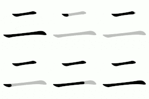
So, for Japanese characters, you’ll start by drawing the topmost stroke, whichever stroke extends the highest of all. For example, in the character for “two,” 二 (に), you’ll draw that top line before the lower line.
Source: Wikimedia.org
Here’s a serious pro tip for you: Try to imagine that your kana and kanji are laid out on a grid—you might even want to use graph paper to practice getting spatial arrangements right at first.
So, they’re all against a grid. The topmost characters are in one row. The middle-height characters are in a second row. The lowest characters are in the bottom row. Start by drawing what’s in the top row.
While drawing whatever is in the top row, you must obey all the following rules before you move on. Once everything in the top row is done, you move down to the middle-height row, and so on.
Exception: This rule is describing standard-length strokes. Diacritical marks (the little dots and dashes which change character sounds) will never come first, even if they’re planted at the very top of the character (see rule #5).
For example, when writing the kana character ご, you’ll draw the top and bottom parts of the C-like shape first, and then you’ll draw the two little dashes (which change the syllable from the “ko” sound to the “go” sound) at the very end.

Souce: Wikimedia.org
These sound-changing dots and dashes are known as diacritical marks. Even if they’re at the very top, they’ll always be drawn last.
2. Go left to right
This is pretty straightforward, right? When drawing 二, you’ll draw both lines from left to right. Congratulations, with these two rules you can now draw 二 perfectly! I bet you could even draw 三 (さん – three) if you were feeling extra ambitious.
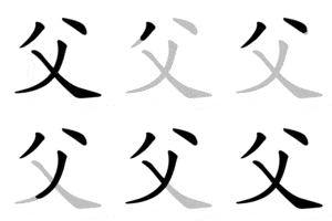
Exception: Right-to-left diagonals take precedence to equivalent left-to-right characters and are written first. For example, the character for “father,” 父 (ちち), is drawn in the following order: (1) top left dash, (2) top right dash, (3) right-to-left diagonal, (4) left-to-right diagonal.
Source: Wikimedia.org
3. Draw horizontal lines first
This rule needs to be combined with rules #1 and #2. The very first stroke you make in a character will be the farther towards the top, the farthest left and it will be a horizontal line.
If there are multiple horizontal lines, you’ll draw the one that’s highest and farthest left first—and you’ll start drawing strokes from the top and left, extending lines right and moving down.
The horizontal lines rule overrides the first two rules in one scenario: If there are vertical lines dropping down through all of the horizontal lines, the horizontal lines will be drawn first.
It does not matter if the vertical line extends above the horizontal lines or farther left than them.
Exception: If there is a vertical line in the mix, but it does not extend totally from the top to the bottom, it is drawn according to the two previous rules. Horizontal lines are not necessarily drawn before shorter vertical lines.
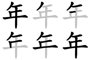
Let’s use the character for “year,” 年 (とし), as an example. The order is: (1) right-to-left diagonal on the top left, (2) top horizontal line, (3) second highest horizontal line, (4) tiny vertical line drawn down, (5) third horizontal line, (6) long vertical line drawn through all horizontal lines.
Source: Wikimedia.org
As you can see, that tiny vertical line took its turn based on the top-to-bottom rule. The horizontal lines only take precedence over the very long vertical line passing through them.
4. Draw very long lines second
You know those characters with long, curly lines? There’s plenty of them in hiragana. They’re going to go second, even if they start at the top. For example, the long curly lines in す、ぬ、め are all drawn second.
Any long line which extends through numerous other lines will be drawn after the smaller lines it passes through. This is helpful for keeping everything proportional and spatially oriented.
5. Add minor dashes, dots and other trimmings last
All the tiny symbols which alter syllable sounds (for example, the little dashes next to a character like ぱ) will be drawn at the end.

Source: Wikimedia.org
6. Draw the dividing line first for symmetrical characters
That was a little wordy for a quick and easy rule, right? It’s not as complicated as it sounds. Sometimes you’ll encounter a kanji character which has little wing-like dashes flanking it.
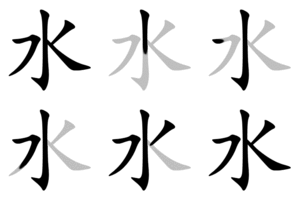
For example, you’ll probably recognize the character for water 水 (みず). This character is drawn in the following order: (1) Middle vertical line, (2) left wing, (3) right wing.
Source: Wikimedia.org
Notice that the wings still follow the left-to-right rule.
7. Draw boxes in three strokes
I’m sure you’ve seen little boxes in your beginning level kanji. They’re everywhere, so this rule is another doozy. Just look at the character for the number four, 四 (よん/し).
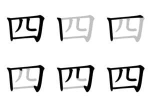
The left side is one line. The top and right sides of the box are one unified line. And the bottom side is one line. Count ’em—that’s three!
8. Write boxed characters before closing the box up
Let’s look at what happens to those box contents.
When drawing 四 completely, the correct stroke order is: (1) left line drawn top to bottom, (2) top line drawn right and down to form top and right sides of the box, (3) left line inside box drawn top-to-bottom, (4) right line inside box drawn top-to-bottom, (5) bottom line drawn left-to-right.
Source: Wikimedia.org
9. Pay attention to detail
This is where you really distinguish your Japanese writing skills. Want all your characters to look like a native Japanese speaker drew them? Then you need to pay attention to all the little details that give characters their standard appearances.
- Overall size. No kana should be larger than another kana. Even though they’re all different shapes, they need to be written on the exact same scale.
- Diacritical marks (“). Those little dashes are not English-style quotation marks, so they should not be written as such. They have a slight curve (but very little) and are always slanted to the left. They should also be nestled in the same place each time. Pay attention to how they appear in standard Japanese writing.
- Curves. Never neglect a curve. If you draw the curved part of ぎ too round (or not round enough) it’ll look all wrong. Same goes for a character like, こ. Don’t draw that bottom lip round and curvy like the English letter “J,” or it’ll look all messed up. Instead, this small curve is more of a slightly rounded flick.
- Hooks. These often go totally unseen to the untrained eye, but missing hooks are a major culprit for Japanese writing looking all wonky. Take a good hard look at characters like み and ひ, and don’t forget to include hooks where needed.
- Full stops. These characters were all traditionally painted with wide brushes. This explains many of their shapes and styles. One important element of these strokes is how they end. At the end of each line, a traditional paint brush would be (1) pressed down extra hard for a blunt, full stop or (2) drawn out long for a lingering line that fades away gradually. So, always pay attention to how all lines end: Is there a full stop or a long stroke?
- Lingering brush lines. The far-right end tip of ん is a lingering, fluid, drawn out brush stroke.
- Spacing between lines. Within one character, the spacing between all the different strokes needs to be correct. For example, if you draw the horizontal lines of き really far apart instead of close together, you’ll have one weird looking kana on your hands.
- Angles between lines. The angles where the lines meet needs to match that of the standard kana. For example, メ can’t be drawn with perpendicular lines (as in the lowercase English letter “t.”) You have to get the angle of the vertical line right, the angle of the horizontal line right, and the angle between the two lines where they intersect can’t be too acute or too obtuse.
- General angle of symbols. Tilting the メ character completely upright (again, like “t”) would result in a total non-Japanese symbol. You have to tilt the entire character on the same angle every time.
- Relative sizes of lines. Imagine if the bottom part of the hiragana き was HUGE and the top with the lines was really minuscule. Everything needs to be proportional within the character itself for your writing to be proper and legible.
- Relative sizes of component characters. Got a complex kanji? You need to consider all the above details for the component characters within the kanji.
Hate to break it to you, but when you’re writing the kanji character 露 (つゆ – dew), you need to get each component within the character perfect. The 雨, 足 and 各 have to have the right proportions compared to one another within this kanji. You can’t draw out the 雨 character on the top like normal or it would look way too big—as you can see, it’s a little squished and extended horizontally.
In the context of this kanji, you can’t draw 雨 like you would draw it on its own. Keep this in mind and you can totally avoid writing disjointed-looking kanji.
10. Get hands-on practice with these resources
Alright, that’s all for the rules and exceptions. It seems like a lot of information when it’s all laid out like this, but think about it this way: You just read one little blog post, not an entire novel.
What you do need is tons and tons of hands-on practice.
- Try doing writing practice by hand with these great hiragana writing practice worksheets. Hiragana is perhaps the easiest place to start. After you’ve mastered the basics of stroke order with this simpler writing system, you can move on to kanji characters.
- To see stroke order come to life, check out any Japanese character’s Wiktionary page. Look at this one for 国 (くに – country) to see what I mean! They’ve got animated gifs which illustrate the stroke order for you, just like the ones you’ve seen throughout this post.
- For some digital practice, there are some great apps specifically designed for stroke order practice. Some learners swear by KanjiQ (iOS), which is all about kanji training with flashcards. Their newest feature is the kanji writing practice option, where you get to observe proper stroke order and try it out for yourself. The app will correct you along the way.
- My personal favorite Japanese learning tool is Obenkyo (Android only). This app is all about total Japanese vocabulary reading and writing mastery. You’ll get to observe animated demonstrations of stroke order, get in hands-on writing practice and get immediate feedback from the app.
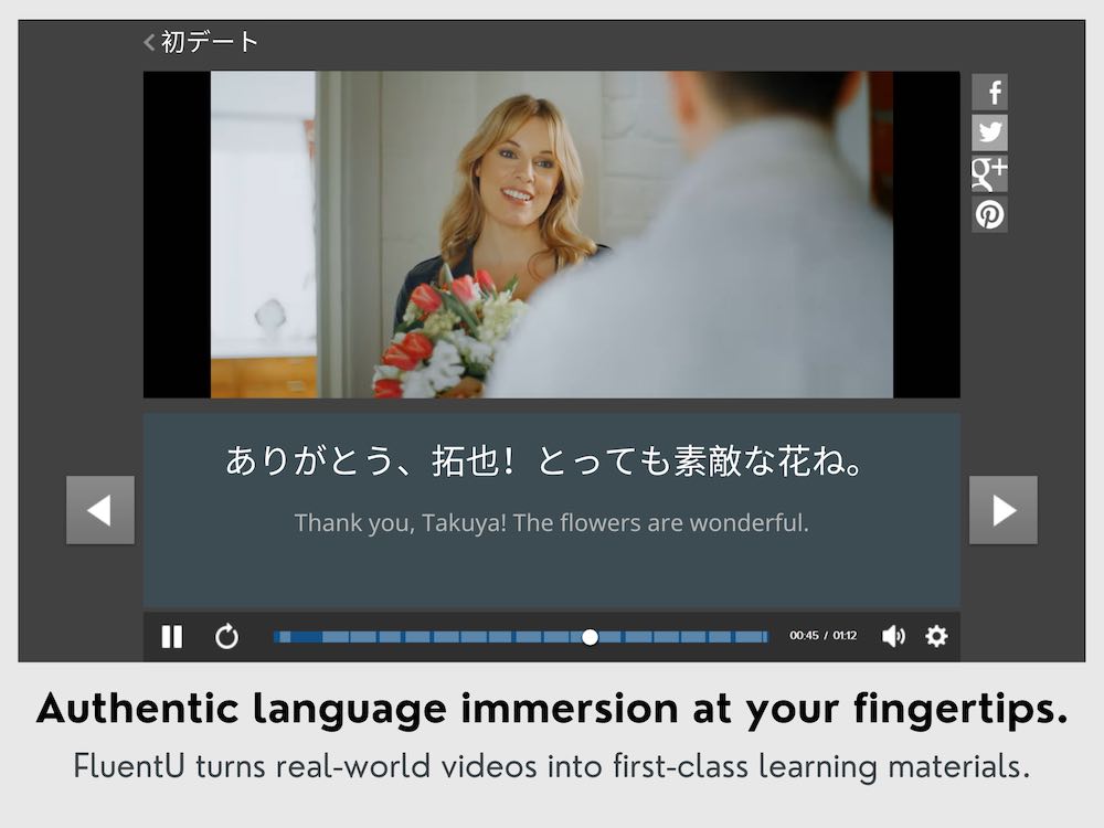
While the language learning program FluentU isn’t specifically designed to practice stroke order, it does contain personalized quizzes that require you to type your answers. The program also has subtitled Japanese videos.
FluentU takes authentic videos—like music videos, movie trailers, news and inspiring talks—and turns them into personalized language learning lessons.
You can try FluentU for free for 2 weeks. Check out the website or download the iOS app or Android app.
P.S. Click here to take advantage of our current sale! (Expires at the end of this month.)
How to Practice Japanese Stroke Order
The steps for mastering Japanese stroke order all fall under three major categories:
- Learn the general rules. Japanese stroke order is very consistent overall. There are more rules than exceptions. Once you get the system down, you’ll know how to approach pretty much any Japanese writing.
- Learn the exceptions. Japanese stroke order is so very logical that even the exceptions are actually just mini-rules. You’ll find that 90% of the time you draw strokes the same way, and then 10% of the time there’s an extra factor that requires you to pay attention and do things a tad differently.
- Practice your butt off—and make sure pen and paper is involved. Stroke order is the kind of thing that really needs to be done the old-fashioned way. The more you draw all these strokes in their proper order, the better you’ll remember how to form any and all Japanese characters.
So, now you’re armed with everything you could possibly need to master the art of Japanese stroke order.
Roll up your sleeves, grab a pen (or paintbrush) and start practicing!
Download: This blog post is available as a convenient and portable PDF that you can take anywhere. Click here to get a copy. (Download)
And One More Thing…
If you’re like me and prefer learning Japanese on your own time, from the comfort of your smart device, I’ve got something you’ll love.
With FluentU’s Chrome Extension, you can turn any YouTube or Netflix video with subtitles into an interactive language lesson. That means you can learn Japanese from real-world content, just as native speakers actually use it.
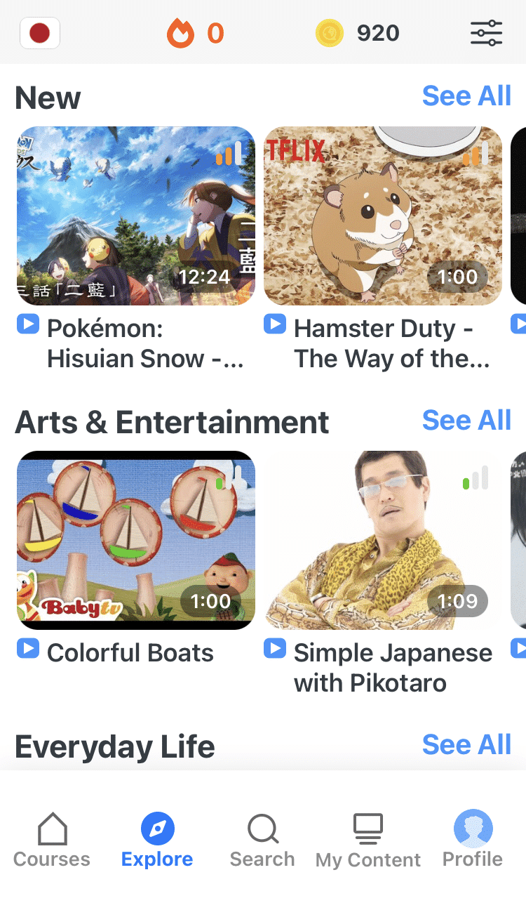
You can even import your favorite YouTube videos into your FluentU account. If you’re not sure where to start, check out our curated library of videos that are handpicked for beginners and intermediate learners, as you can see here:
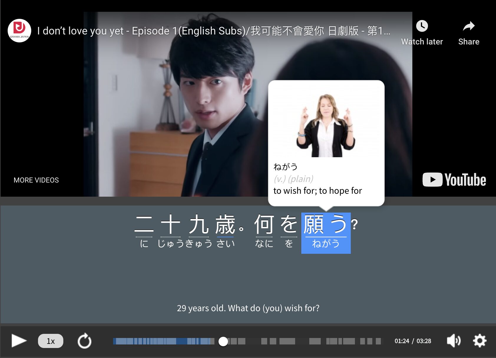
FluentU brings native Japanese videos within reach. With interactive captions, you can hover over any word to see its meaning along with an image, audio pronunciation, and grammatical information.
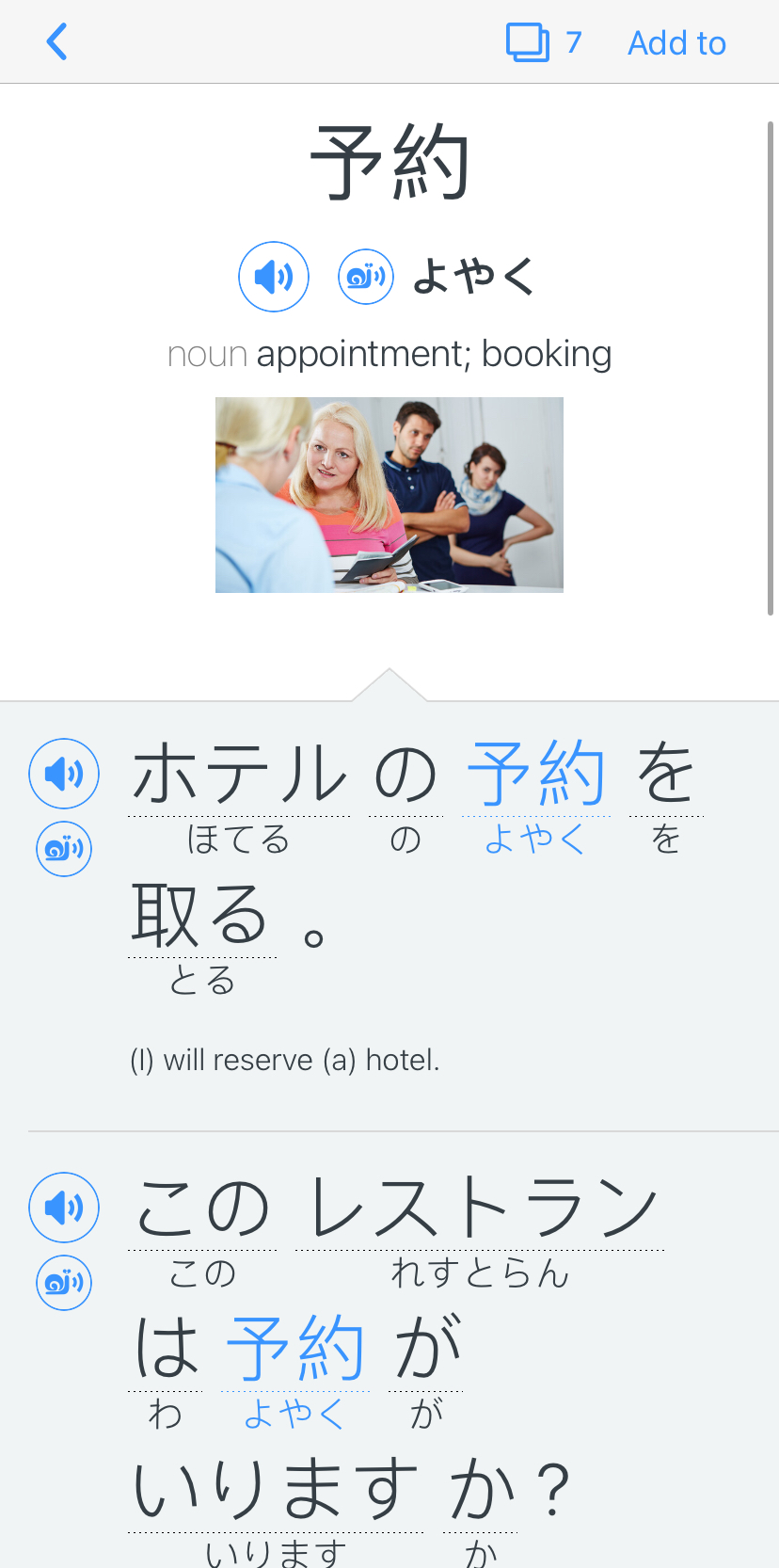
Click on a word to see more examples where it's used in different contexts. Plus, you can add new words to your flaschards! For example, if I tap on 予約, this is what pops up:
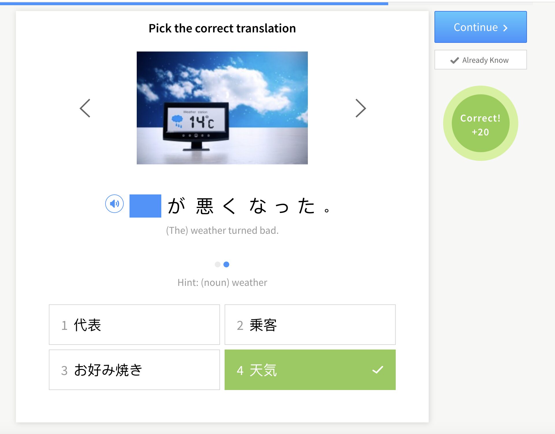
Want to make sure you remember what you've learned? We’ve got you covered. Each video comes with exercises to review and reinforce key vocab. You’ll get extra practice with tricky words and be reminded when it’s time to review so nothing slips through the cracks.
The best part? FluentU tracks everything you’re learning and uses that to create a personalized experience just for you. Start using the FluentU website on your computer or tablet or, better yet, download our app from the App Store or Google Play.
Click here to take advantage of our current sale! (Expires at the end of this month.)
